I recently made a joke online relative to a major – and very respected, if geopolitically controversial – security company advertising its revised “Cyberthreat Real-Time Map”. As many members of the security community are aware, “threat maps” – referred to derisively as “pewpew” maps – are heavy on eye-candy but very light on use or value. Yet pewpew maps – such as that featured by now-defunct security company Norse (pictured below) – remain prominent in security operations centers (SOCs), watchfloors, and sales demos to this day.

This continued presence was correctly highlighted in a response to my original joke – that Kaspersky is hardly alone for maintaining (and advertising) its offering. Oddly enough, roughly the same time as this discussion, a mini-controversy erupted over an alleged (and since debunked) distributed denial of service (DDoS) activity against US cellular providers – based on a pewpew map (below).

Based on the above as well as general reporting, pewpew maps remain popular and are supported by multiple vendors and organizations. In completely unscientific fashion, I tried to figure out if anyone at all that actually works in operational security – not researchers, not leadership, but SOC, IR, or other personnel – found any sort of value in these items. Some responses were quite interesting and potentially valuable, but the majority ultimately could be distilled to the following observation:
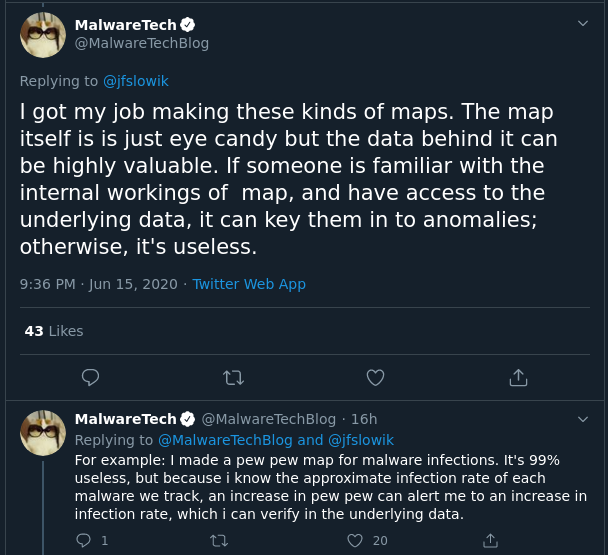
Underpinning all of these responses is that actual extracted value was in underlying data and trend analysis, while the visual aspect was almost universally derided as useless, misleading, or just a ploy to entertain the technically clueless. Although potentially “useful”, such uses were outside the realm of actual security operations and typically aligned with either entertainment or budget justification.
One common theme that emerged from those not wanting to just completely discount such items was the potential value of pewpew maps for communication purposes. Even if the data was unrepresentative, old, or biased (based on sources, collection, and visibility), geographic-based visual representations still provide an easy-to-grasp, impactful means of showing “cyber”. Looking at spreadsheets and log files may be more accurate, but few CISOs (or even department managers) have the time, interest, or expertise to do so. Along this line of thought, pewpew maps are fundamentally flawed, but represent a “best effort” attempt to communicate risk and security to leadership.
I am sympathetic to the motivations behind this argument, but I find the argument fatally flawed. Essentially, the benign view of pewpew maps posits that inaccurate, unrepresentative communications and visualizations are OK as a means to represent one’s organization (and value provided by that organization) for lack of other options. This seems defeatist from the perspective of information security as a discipline, and disingenuous (or outright deceptive) for security as a business unit. The position attempts to argue that providing misleading data to critical decision makers is acceptable in an “end justifies the means” perspective – yet reliance on such deception cannot last forever, and only serves to paint security in a bad light (e.g., willing to deceive or manipulate for the sake of justifying budget).
However, the underlying concern is real: security must find a means to meaningfully, and quickly, communicate to decision makers the security landscape and threat environment. Under this view, pewpew maps remain fundamentally flawed for a number of reasons:
- The geographic basis of such maps ignores the very structure of the modern, cloud-centric internet.
- Attackers rarely operate direct from some mythical “home” network but leverage a combination of cloud providers, virtual private servers in various domiciles, and compromised, legitimate infrastructure to execute operations.
- Many organizations (and especially most with robust threat intelligence and information security programs) operate in physically global but logically interlinked operations such that a geographic overlay of network traffic poorly aligns with actual risk posture and communication.
My view is potentially biased by a career-long focus on state-directed or -sponsored malicious cyber activity, but my knowledge of likely criminal behaviors seems to support the above observations as well. For example, Japan-domiciled Honda recently experienced a significant ransomware attack. While based in Japan, the event appears to primarily impact manufacturing operations in North America, Brazil, India, and Turkey – with no specific mention of operations in Japan. Furthermore, the actual infection vector or mechanism remains unclear – speculation indicates open RDP, but has not been proven. Yet in all cases, the combination of potential initial intrusion scenarios, company organization, and resulting impact all show that geographic-specific tracking and sorting of data is unhelpful and meaningless is trying to track or understand what will ultimately be a very expensive, disruptive event. A Japan-centric viewpoint of attack destination would ignore the risk posed by the company’s multiple subsidiaries in various locations, while a threat-focused geographic view would ignore the possibility of various infrastructure types – including within the company’s home country – to be used to execute malicious activity.
Shifting to state-directed operations, we can look at items related to the recent NSA disclosure on SANDWORM activity. SANDWORM is associated with Russian military intelligence – so a geographic-centric view would presumably associate the origin of SANDWORM operations with Russian network space. However, as nearly all information security practitioners are aware and as supported by data from multiple engagements, a review of infrastructure associated with SANDWORM-linked activity shows a collection of geographically diverse (although largely focused on Europe) IP addresses reflecting multiple likely compromised but otherwise legitimate endpoints. Limiting ourselves just to activity linked to the NSA disclosure, the following infrastructure appears related to SANDWORM operations from as early as 2017 through the present:
| IP Address | Hosting Provider | Location |
| 103.94.157[.]5 | SBP Corporation | IN |
| 119.252.189[.]49 | ZoneNetworks | AU |
| 176.10.104[.]219 | Softplus | CH |
| 176.53.12[.]163 | Radore | TR |
| 185.226.67[.]190 | Aweb | GR |
| 185.53.179[.]6 | TeamInternet | DE |
| 193.200.209[.]200 | Infium | UA |
| 194.117.236[.]33 | MyserverMedia | RO |
| 195.211.197[.]25 | Tomich | RU |
| 31.148.63[.]236 | FlashInternet | UA |
| 46.151.81[.]242 | BigNet | UA |
| 46.161.40[.]16 | WS171 | RU |
| 46.28.202[.]254 | Solarcom | CH |
| 46.4.10[.]58 | Hetzner | DE |
| 5.255.90[.]243 | Serverius | NL |
| 68.235.34[.]235 | Tzulo | US |
| 77.47.193[.]36 | NTUU KPI | UA |
| 78.130.144[.]40 | Cooolbox | BG |
| 78.25.21[.]3 | Alkar | UA |
| 79.124.75[.]234 | Telepoint | BG |
| 87.230.102[.]40 | PlusServer | DE |
| 89.108.72[.]196 | Agava3 | RU |
| 91.195.240[.]117 | Sedo | DE |
| 91.197.145[.]114 | Kumir | UA |
| 91.205.6[.]143 | Sunline | UA |
| 92.62.139[.]114 | Baltneta | LT |
| 95.216.13[.]196 | Hetzner | DE |
A geographic overlay of the above data might identify some weak trends (use of former Soviet republic service providers, overall focus on European providers in general), but nothing that really makes sense or provides anything substantially actionable – unless one wishes to block all network traffic from former Soviet republics, or Europe in general.
There are many epistemic reasons why geographic overlays remain both desired and appreciated – they orient something that is fundamentally divorced from physical space into a tangible realm, while also supporting conventional, “who-centric” assessments of observed activity (of course Country X is “attacking” Country Y!). Yet the realities of cyber operations and the increasingly fractured hosting space make such assessments unrealistic at best, and deeply misleading at worst. But at the same time, the industry needs some succinct, visual mechanism to represent activity in a way that can quickly and accurately be communicated to leadership.
One possibility that I think has many merits – and is reflected in many of the responses in my call for good examples cited previously – is use of topical heatmaps. Such items need not be limited to physical, political geography, but can incorporate items such as malware families, hosting providers, or other observables. For example, adversaries use a variety of entities to host “bad” things – determining that Hetzner or OVH are the source of significant amounts of such traffic (irrespective of specific hosting geography as these entities operate in multiple countries) may appropriately communicate the risk posed by unrestrained traffic to certain providers and ASNs. This seems far more relevant, actionable, and accurate than just saying “Hey it looks like a lot of phishing messages come from Germany”.
Yet heat maps also have their limitations depending on available mechanisms to parse or collect data. Observed “trends” may simply reflect the overall nature of the data set in question. At the same time, even this limited observation might be useful in at least communicating how something like a geographic IP block of Iran or something similar might be relatively meaningless (given limited or no traffic) while actual threats emerge from massive datacenters located in suburban Washington, DC.
Overall, a plethora of potential options exist for threat and risk visualization designed for non-technical audiences. That so many organizations continue to rely on geographic-centered pewpew maps therefore appears both disingenuous (for reasons noted above) and intellectually lazy. If we, as practitioners of information security, wish to be taken seriously and have our voices heard, we should strive to make sure we communicate in ways that are not only impactful, but also accurate and meaningful. The pewpew map does none of these things as a visualization, and may even skew perspectives and understanding in ways that undermine our industry in the long term. As a result, we must identify alternatives that both reflect underlying realities while speaking to the needs and perspectives of their intended audiences.


